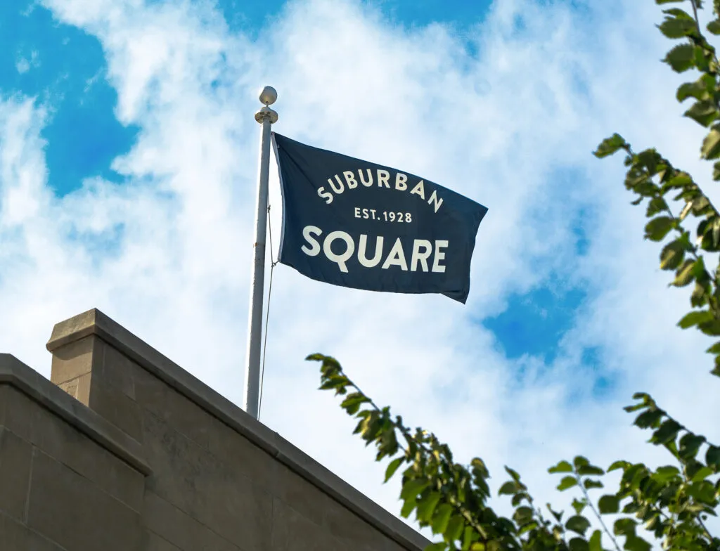
Union Square
Hip to be Square

- Brand Strategy
- Brand Identity
- Brand Activation
- Branded Environment
- Website
- City & Place
Where Frank Lloyd Wright Meets Jimmy Choo
Union Square is at the heart of San Francisco, quite literally. It has been around since 1850 and was ready to reinvent itself within a city that was changing rapidly around it. In research and positioning, we looked to that storied past and embraced what the square represents to both global tourists and locals alike today. It all came down to a whole lot of everything in just a few square blocks. A vibrant neighborhood that earned its spot at the heart of one of the greatest cities we’ve got. We brought it all to life with a refined and equally boisterous brand identity and voice that spoke to the beautiful union of all the things in and around the square.

The Beating Heart of San Francisco
From workshops with retailers to site visits and surveys, our research and discovery led us to the heart of the matter…Union Square is the quintessential heart of San Francisco and always has been. They just needed to own it. This inspired our creative work and became a rallying cry for a once-thriving district on the way back up.
Business in the front. Party in the rear.
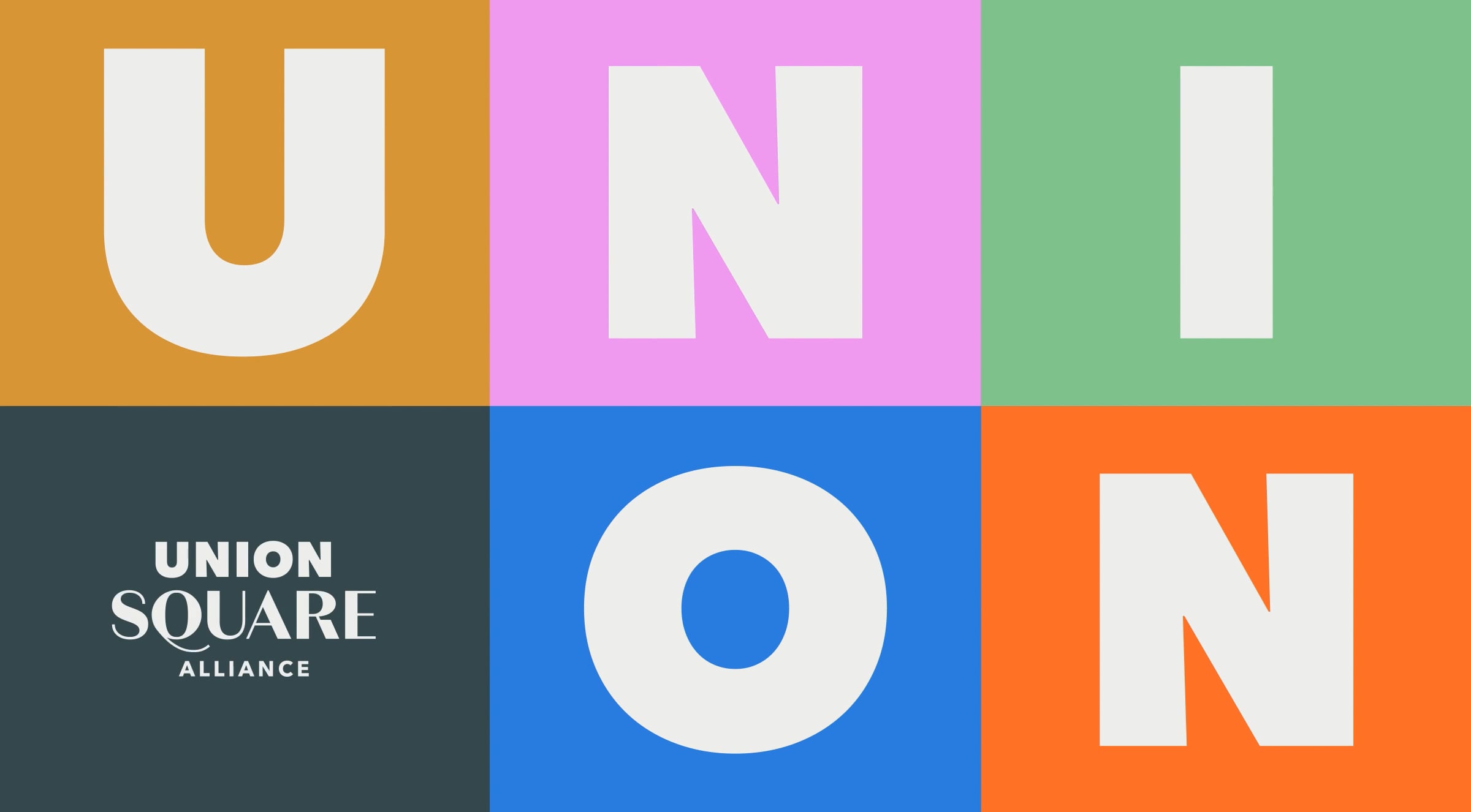
The new brand is designed to capture the timeless energy, joy, and variety that Union Square packs into its streets. The logotype flexes to be colorful and diverse for the public, while remaining strong and established for the Union Square Alliance, the business improvement district. It’s a perfect expression of form following function as a single brand becomes two.


One and All
Inspiring locals to play tourist and tourists to play local, the brand voice and visual identity invite everyone to play. With a refined and equally boisterous tone, the essence of Union Square speaks to the beautiful union of all the things you can experience in just a few square blocks.


Squared Up
With a name like Union Square, it was a no-brainer to run with the almighty square as our hero graphic element, celebrating each corner in all it forms. With infinite opportunities for interpretation — confetti to content containers and everything in between — the brand celebrates Union Square as a bustling melting pot that is anything but square.


Painting the Town
In and around the square, we transformed street cleaners into brand champions, trash cans into billboards, and maintenance vehicles into traveling art pieces. This not only made a colorfully striking impact on the cityscape, it reinforced the Alliance’s ongoing commitment as stewards of San Francisco.


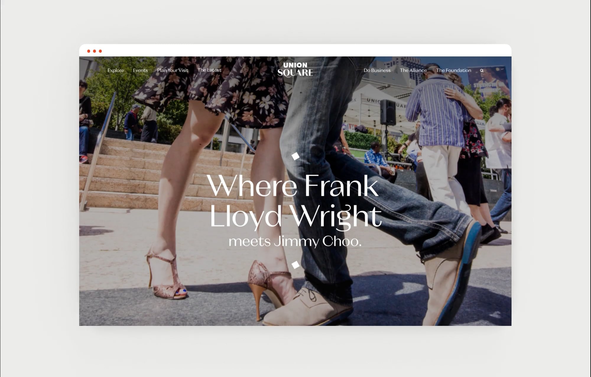
Site Fit for the Square
As a gateway to the city, Union Square’s website needed to be a virtual expression of that same concept. With a simplified sitemap and an intuitive design focused on the visitor experience, you can scroll from Gucci to Nike in no time flat — and from a Christmas tree lighting to a drag show just like that.

“They’re truly client-focused and eager to hear our needs. They advise us along the way. Listen to J2’s advice and work with them — they’re excellent.”
Benjamin Horne—Deputy Director, Union Square