The Ivy
Address to Impress
- Brand Identity
- Brand Activation
- Branded Environment
- City & Place
West of Ordinary
Beechwood Properties came to us to rebrand their latest property in University City, Philadelphia, they faced a challenge: how to stand out in a highly competitive market while capturing the essence of a neighborhood known for its academic, tech, and cultural vibrancy. They needed a brand that would resonate with a diverse group of potential tenants—students, professionals, and innovators—while also reflecting the property’s modern amenities and community-focused atmosphere. The task was to create a brand that felt both fresh and rooted in the energy of the neighborhood, setting it apart from the crowd.

Behold the Great Indoors
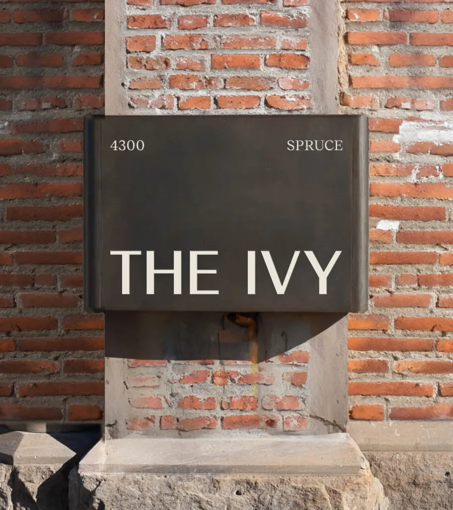
We renamed the property The Ivy to evoke a sense of prestige and connection to the academic heart of University City. The name not only reflects the property’s proximity to some of the nation’s leading universities but also symbolizes growth, resilience, and timelessness—qualities that align with the building’s modern design and community-driven atmosphere. The Ivy stands out as a nod to both the neighborhood’s intellectual energy and its green, vibrant surroundings, making it the perfect fit for the property’s identity.
Life is Suite
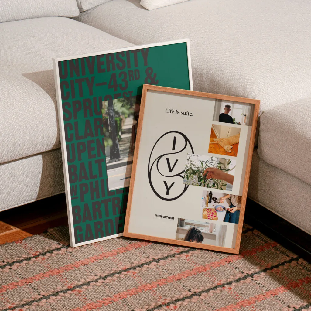
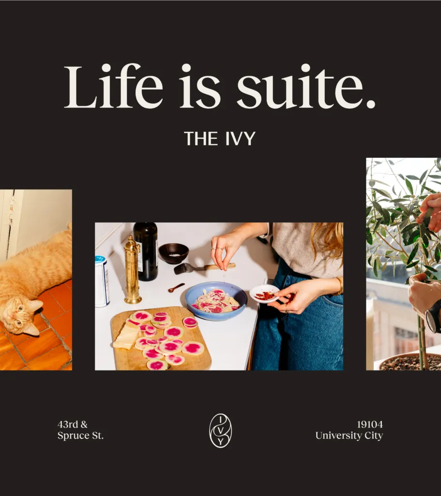
The brand voice for The Ivy is designed to evoke a sense of refined lifestyle, positioning the property as a cultural respite from the fast-paced energy of the city. It speaks to a discerning audience seeking balance—where modern conveniences meet moments of calm. Through sophisticated yet approachable language, we convey The Ivy as more than just a place to live; it’s a serene retreat.
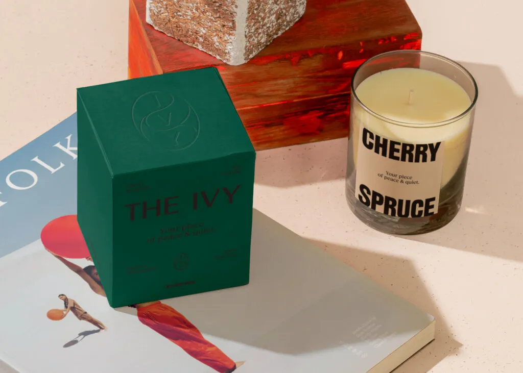
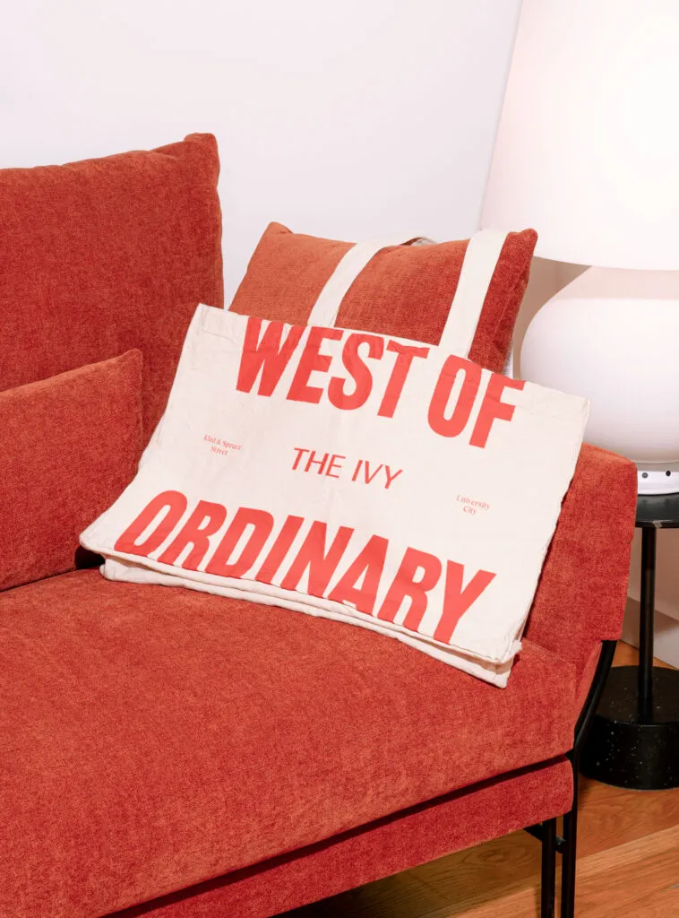
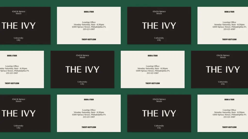
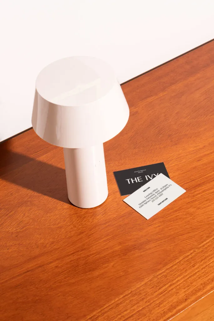
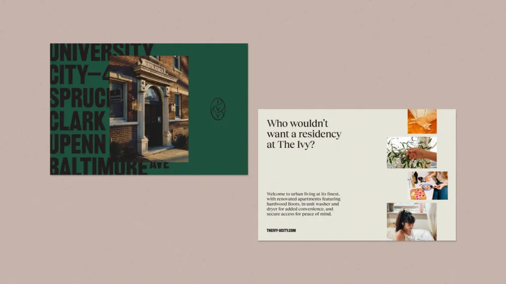
Who wouldn’t want a residency at The Ivy?
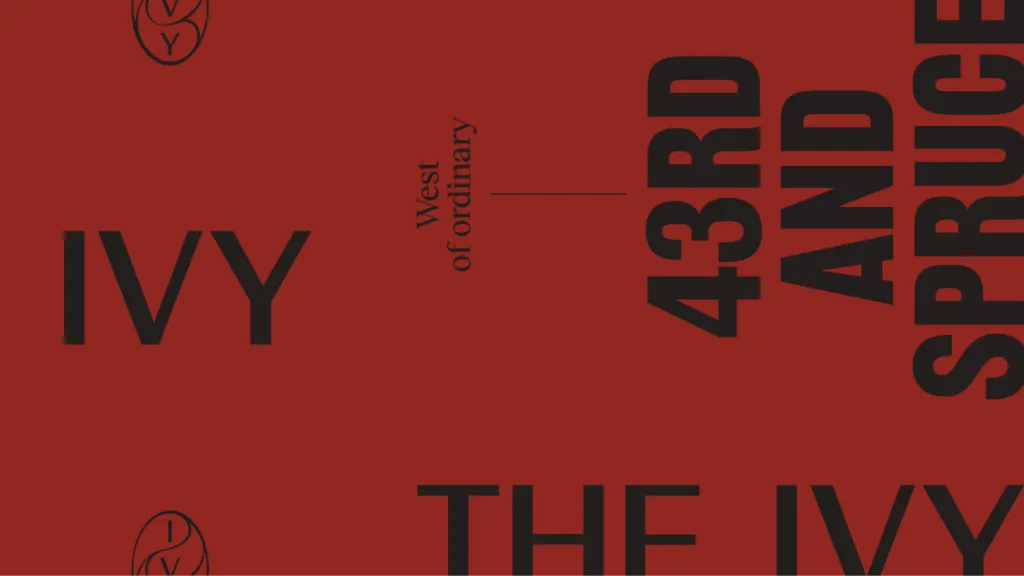
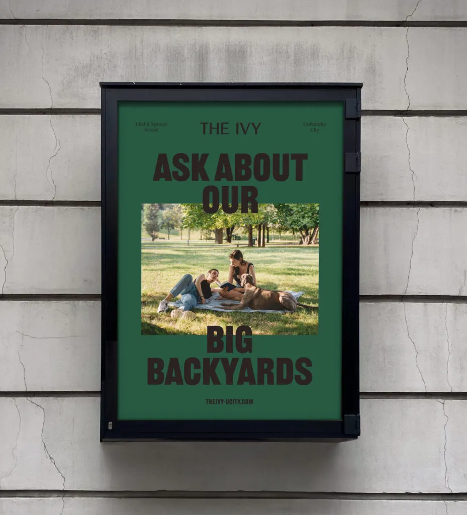
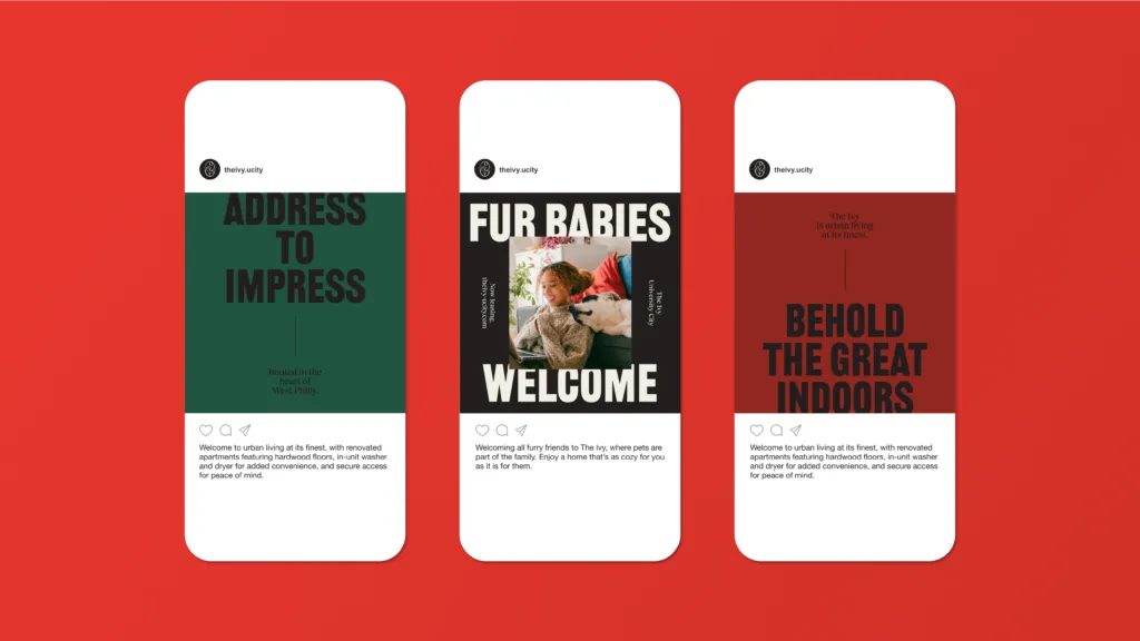
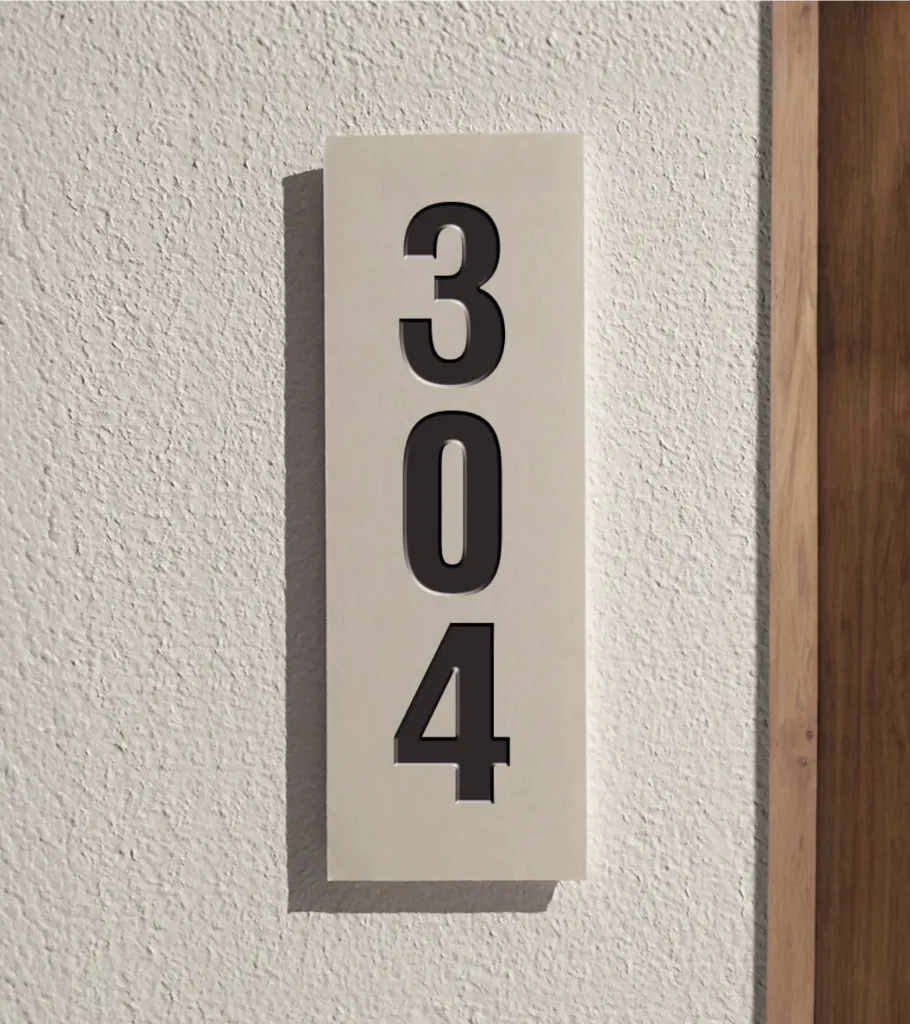
Just as the neighborhood is a blend of academic institutions, cultural landmarks, and innovative spaces, our typography showcases a variety of styles that communicate inclusivity and vibrancy. Each typeface is carefully selected to represent different aspects of the community—bold, modern fonts convey energy and innovation, while classic serif types evoke tradition and stability. This harmonious mix not only enhances visual interest but also mirrors the dynamic character of the neighborhood.
