Mural Arts
Art Igniting Change
- Brand Strategy
- Brand Identity
- Brand Activation
- Branded Environment
- Campaign
- Arts & Culture
- Social Impact
A Fresh Perspective
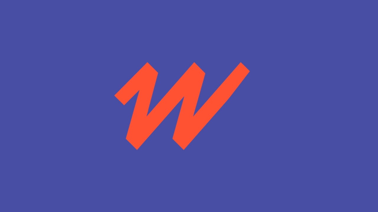
After 30 years leading the charge for public art in Philadelphia, it was time for the Mural Arts brand to catch up to its prolific output. Inspired by the people and the paint, we developed an identity that brings chaos to order and order to chaos. It’s all rooted in a mark inspired by graffiti, but refined and incredibly flexible. Surrounding it is a vast exercise in how form and function can come together to create a brand experience that is both inspired by and supportive of the amazing artists it is here to serve. Because Mural Arts is about all of us, what we bring to it, and the simple fact that art can inspire change.


“J2 brought us together in new ways, to helping us think about how to visualize our mission. They produced work for us that was captivating and inspiring.”
Jane Golden, Founder & Executive Director, Mural Arts Philadelphia


Art Shapes Our City
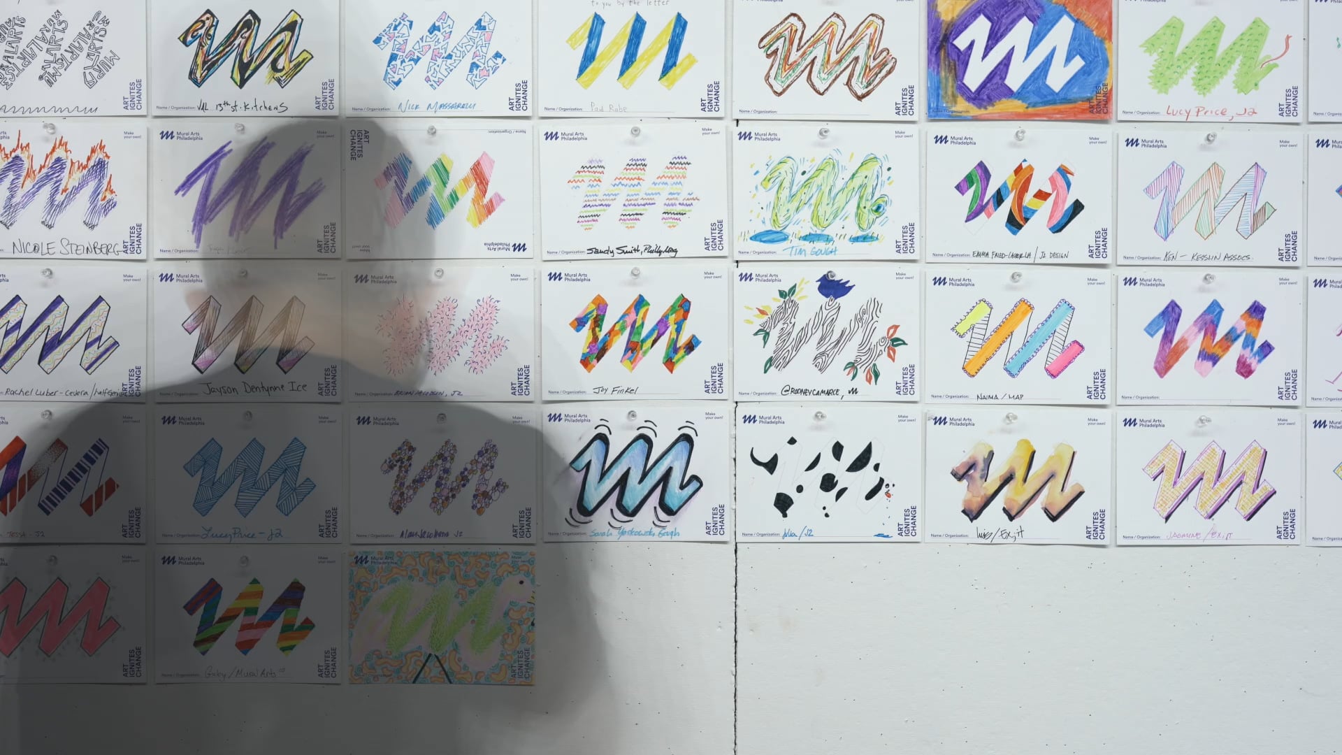
Mural Arts Philadelphia’s new brand identity captures the transformative spirit of the organization, celebrating creativity, connection, and the evolving nature of public art. At its core is the bold and dynamic “M” logo, a versatile symbol that invites reinterpretation, much like the community-driven projects it represents. With vibrant colors, expressive typography, and layered design elements, the identity highlights the stories and neighborhoods that shape Mural Arts’ work.


A First Look at a Fresh Look
To kick off Mural Arts Month, we hosted an unforgettable brand launch event to celebrate the reimagining of Mural Arts Philadelphia. The energy in the room was palpable as the community gathered to hear from Executive Director Jane Golden, Communications Director Nicole Steinberg, and branding partners Alan and Brian Jacobson. Together, they shared insights into the collaborative rebranding process, highlighting the vision and creativity behind the new identity.
“There is something so simple, effective, and energetic about the vectorized graffiti stroke ‘M’ that makes it instantly evocative. It has the right angle, the right spacing, the right abstraction… just very right.”
Armin Vit, Co-Founder & Critic, Brand New


A Template for Success
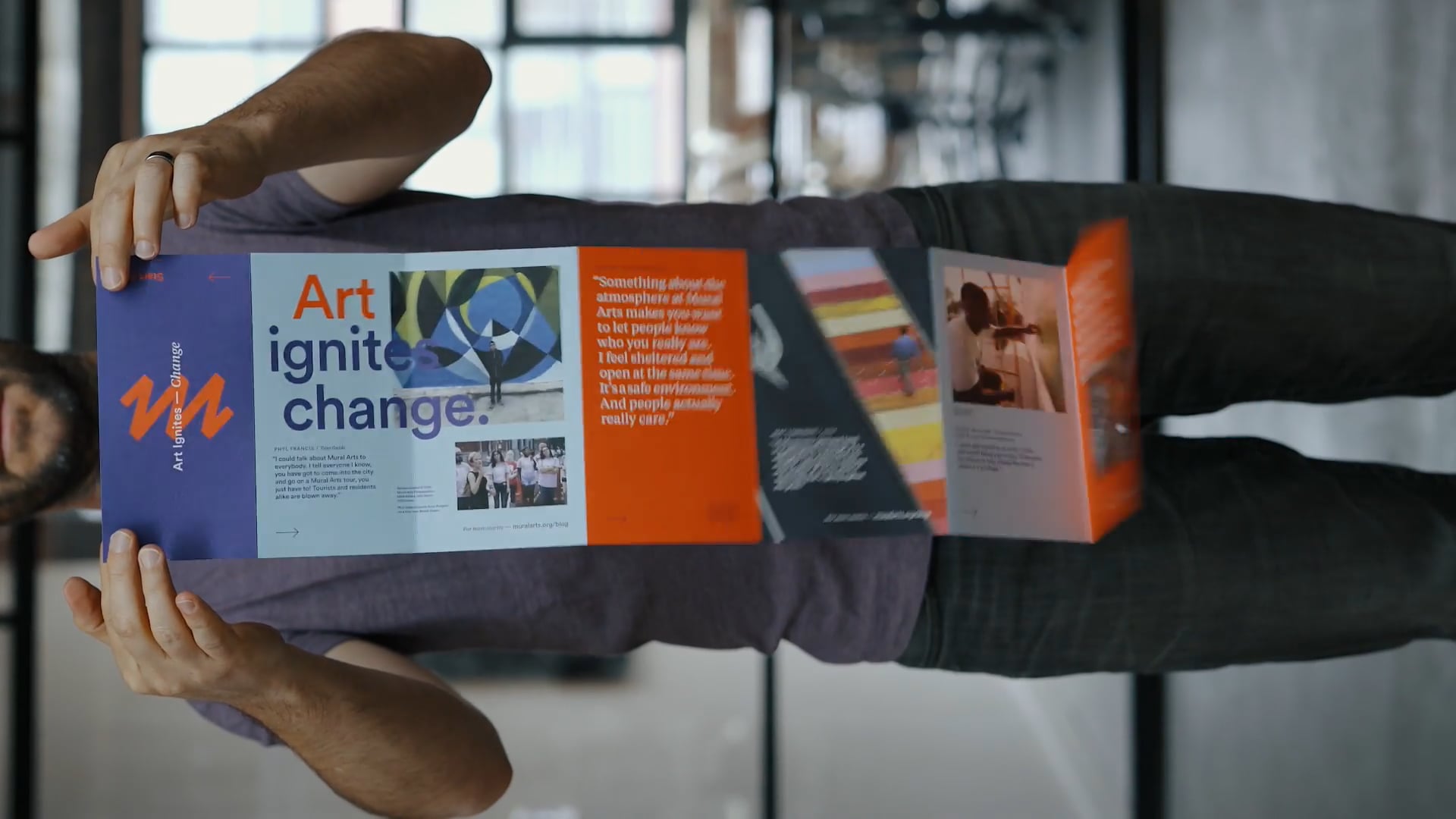
A top priority for the brand overhaul was to build the entire system on a series of templates to ensure the internal Mural Arts team could take the reins once the new designs were developed. From the divisional brochures and annual reports to flyers, posters, and one-sheets, the entire system was developed on a series of flexible grids and templates that are reused and repurposed intentionally for internal resources and budgetary efficiency.


Wearable Art
The iconic “M” logo is perfect for merchandise, serving as both a bold visual statement and a meaningful symbol of community and creativity. Its modular design invites reinterpretation, making it ideal for artist collaborations and limited-edition pieces that celebrate the organization’s projects. Whether on T-shirts, tote bags, or pins, the “M” transforms each item into a wearable work of art.


Staying Current
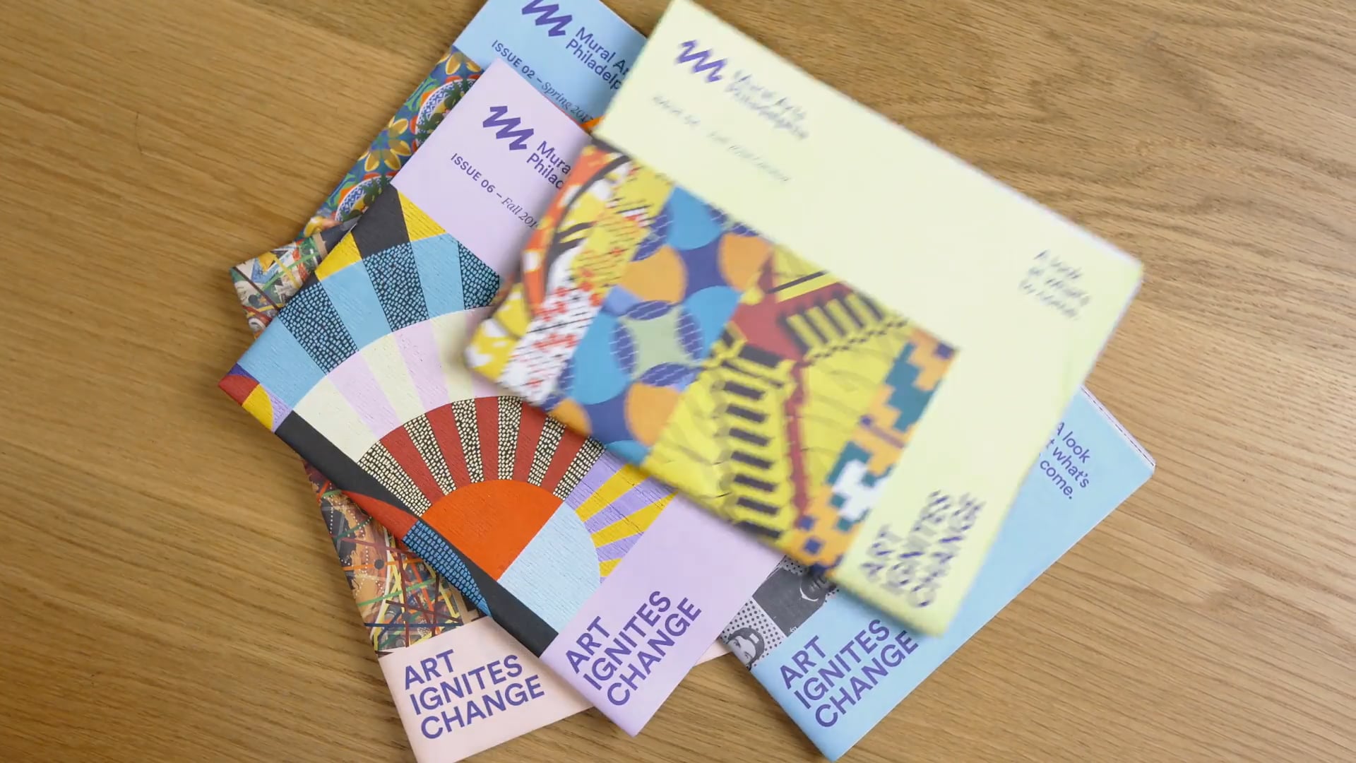
The biannual newsletter we designed for Mural Arts Philadelphia is more than an update—it’s an experience. Each edition keeps readers informed about ongoing projects while immersing them in the organization’s vibrant world. Through dynamic layouts and thoughtful storytelling, the newsletter brings words and images to life, showcasing the diversity of projects and communities that Mural Arts touches.