Love Park
Feel the Love
- Brand Identity
- Branded Environment
- City & Place
Live in Love
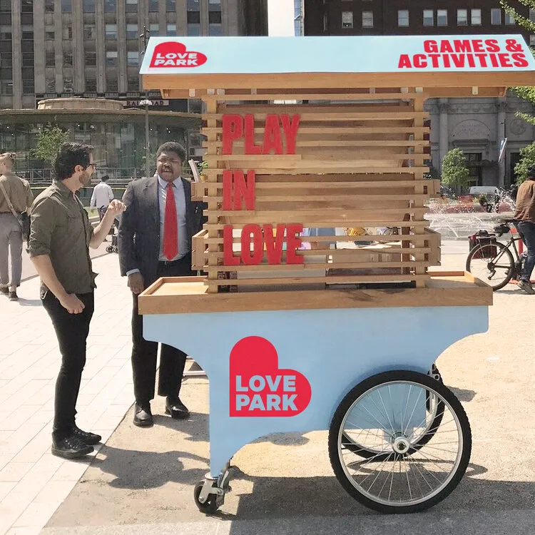
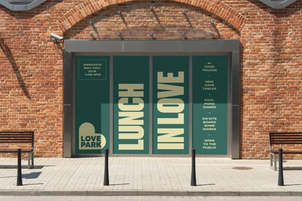
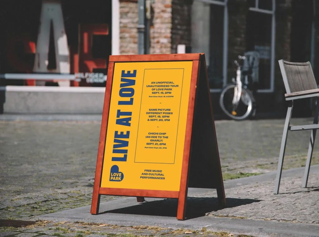
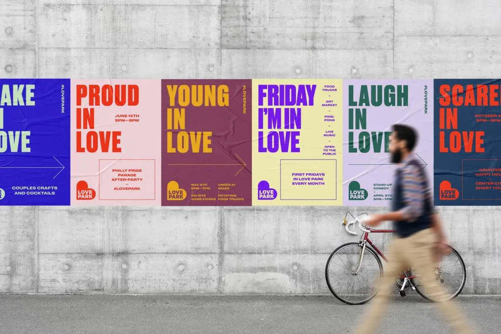
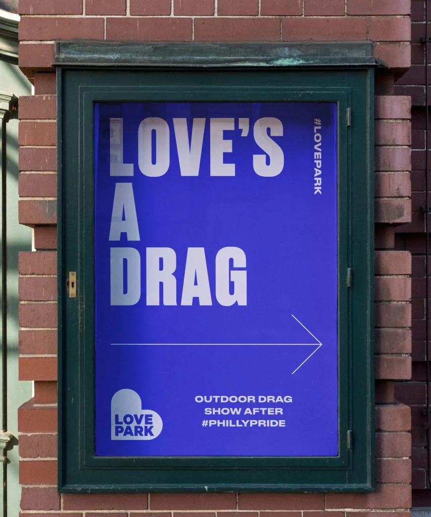
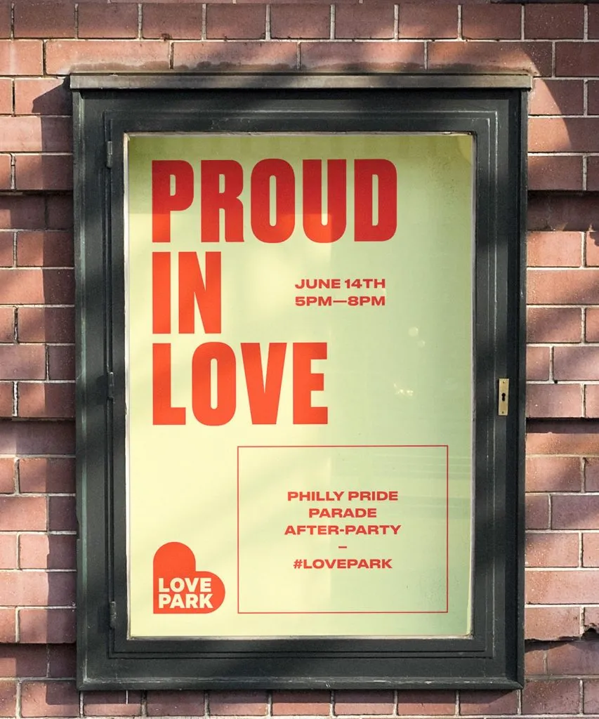
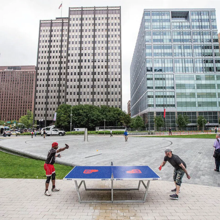
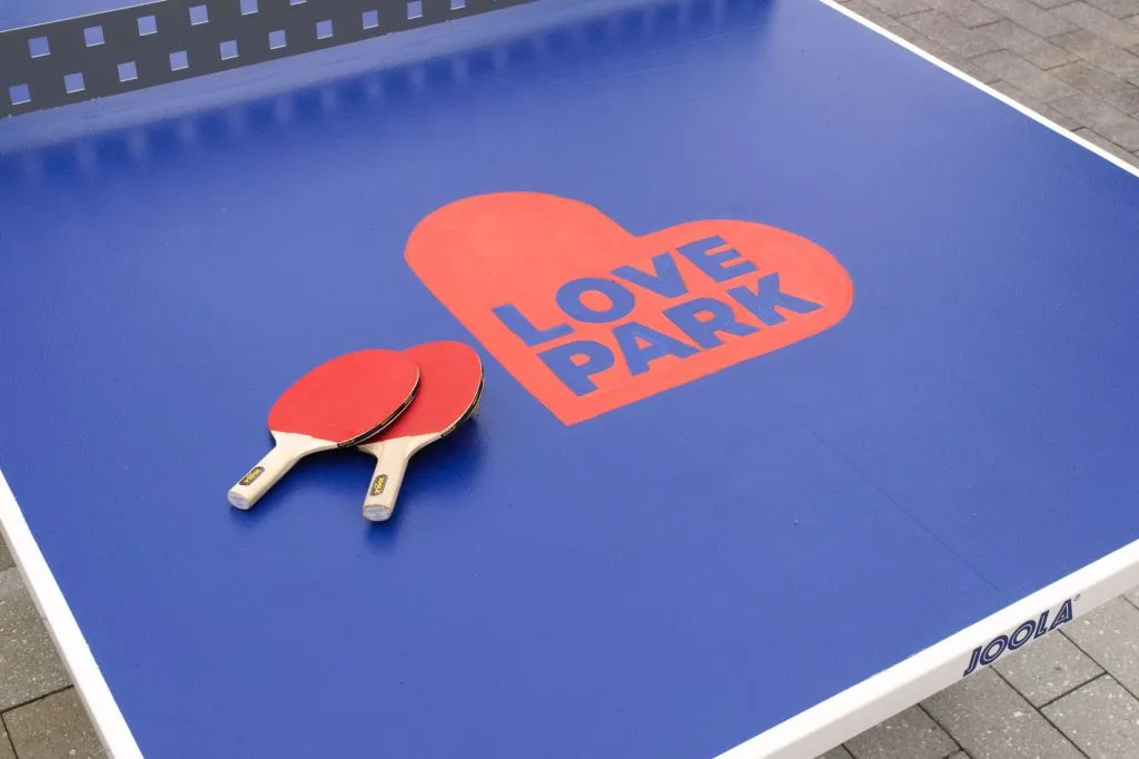
The LOVE statue (and the park it sits in) is one of the most iconic spaces in Philadelphia—which itself is a city of iconic places. We set out to make our city proud and deliver a flexible brand identity that spoke to locals and visitors alike. In doing so, we created a visual identity and personality that was as comfortable welcoming a food truck festival as a black-tie affair. The identity plays in the park across signage, advertising and even ping pong tables (bucket list checked).
The Heart of the Matter
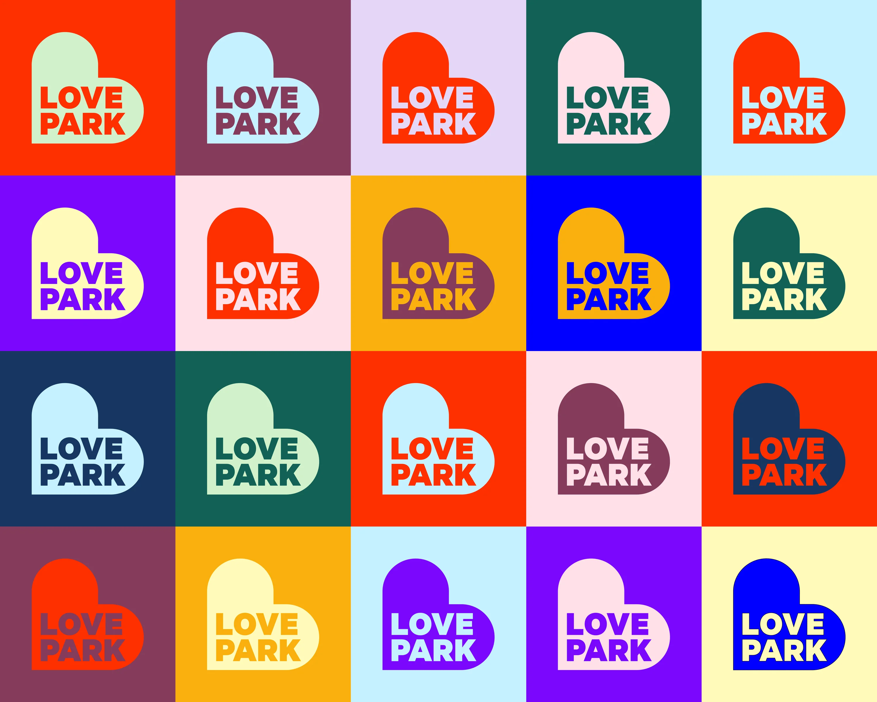
The new heart logo transcends the iconic LOVE statue, offering Love Park a fresh identity that encompasses much more than just a single symbol. While the LOVE statue holds a cherished place in the park’s history, the heart logo represents a broader concept of love that resonates with everyone who visits. It embodies connection, community, and the diverse experiences that the park fosters, inviting people to engage with its many offerings.
Love Language
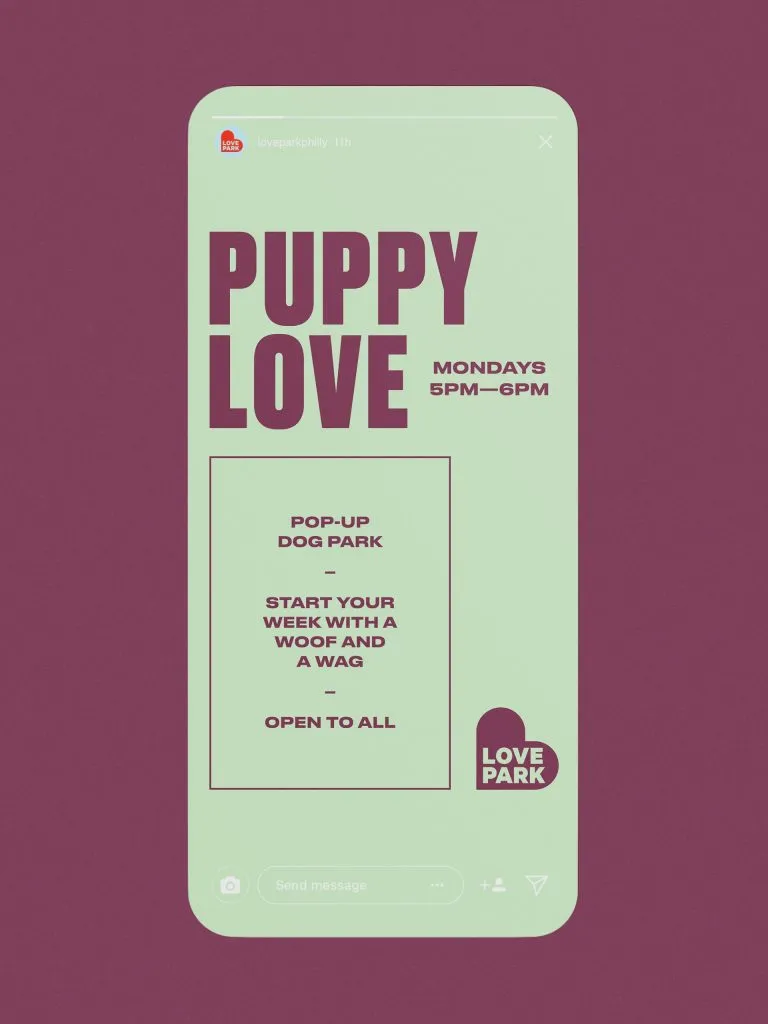
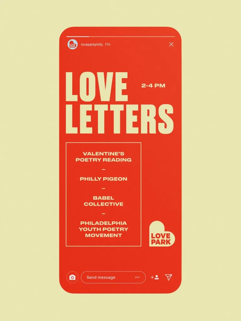
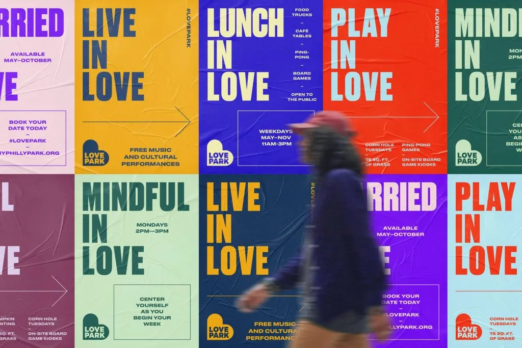
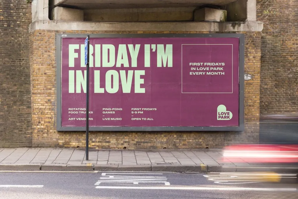
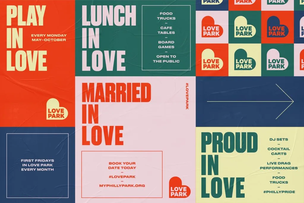
The brand voice we created for Love Park is playful, vibrant, and wholeheartedly embraces all things love. It speaks with a warm, welcoming tone that invites people to connect, celebrate, and share moments of joy. Whether highlighting the park’s iconic history or engaging visitors through fun, lively messaging, the voice captures the spirit of togetherness that defines Love Park.
Seasons of Love
The vibrant color palette symbolizes the seasonality of the park and the rich diversity of its people and offerings. Each hue reflects the changing moods of the park throughout the year—bright, sunny tones for summer, warm, earthy shades for autumn, and crisp, refreshing colors for spring. This dynamic range not only mirrors the park’s natural rhythms but also celebrates the variety of experiences and cultures that come together in this beloved space.
