Friends’ Central School
Let’s Be Friends
- Brand Identity
- Brand Activation
- Education
A Shared Rallying Cry
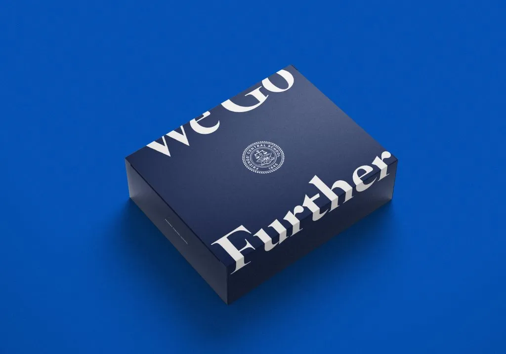
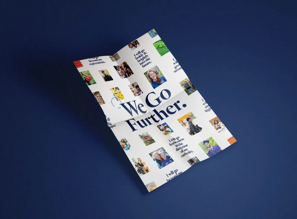
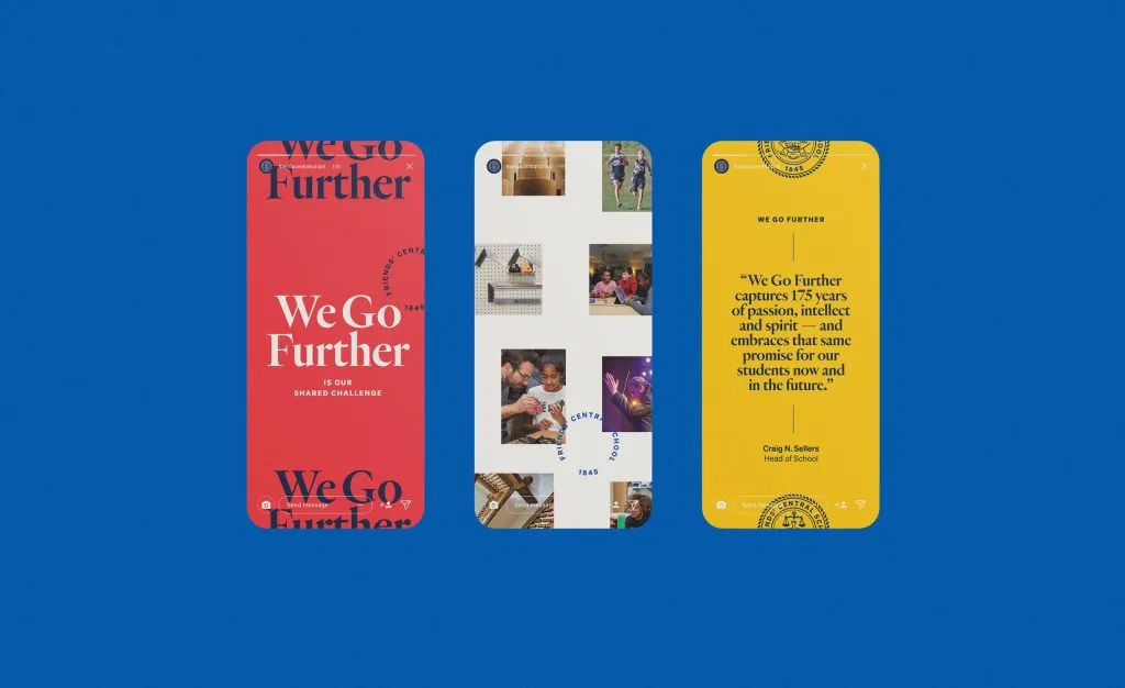
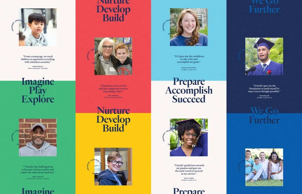
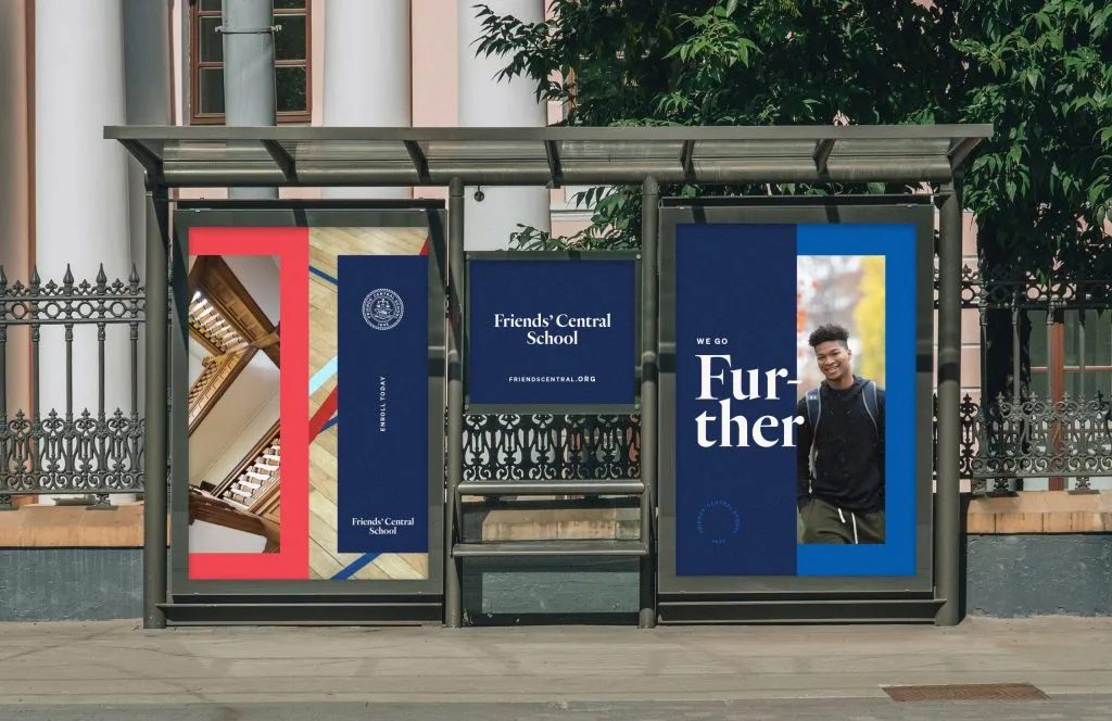
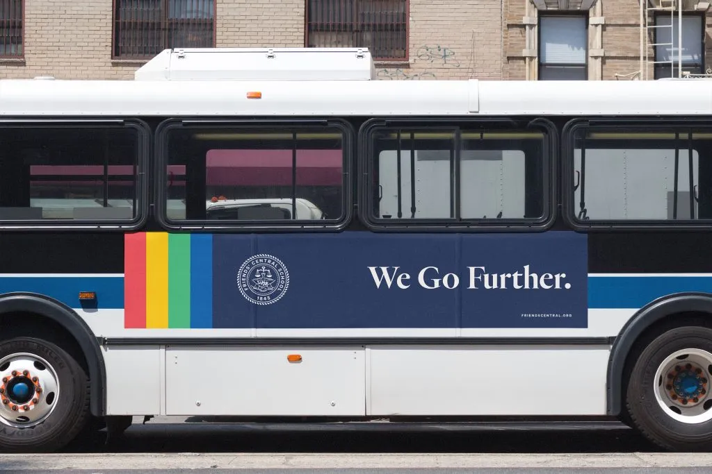
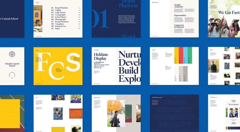
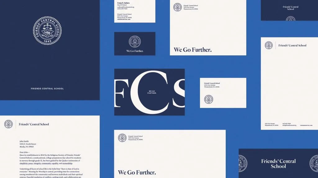
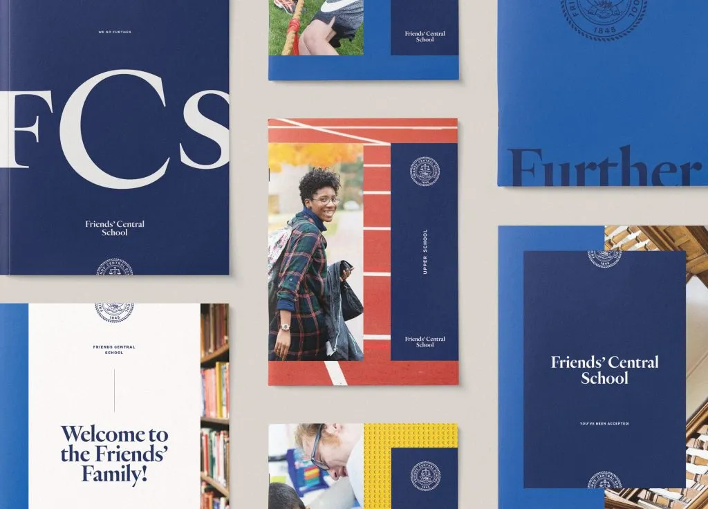
We leaned into the Quaker values on which Friends’ Central School was founded to build a brand that honors their history and emboldens their forward-thinking approach to education. Starting with positioning the school around the idea of being stronger together, we developed the mantra “We Go Further” to give the school community — faculty, staff and families — a shared rallying cry. United by the new shared mission and refreshed brand identity, Friends’ Central is now moving further as one of Philadelphia’s most sought-after Quaker educational institutions.

At the Center
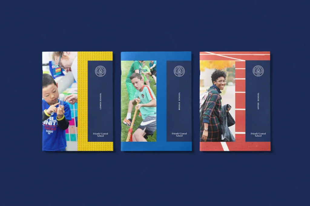
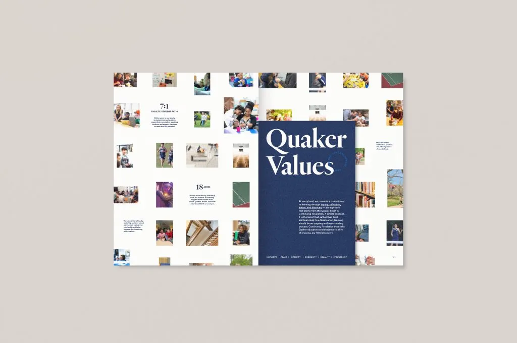
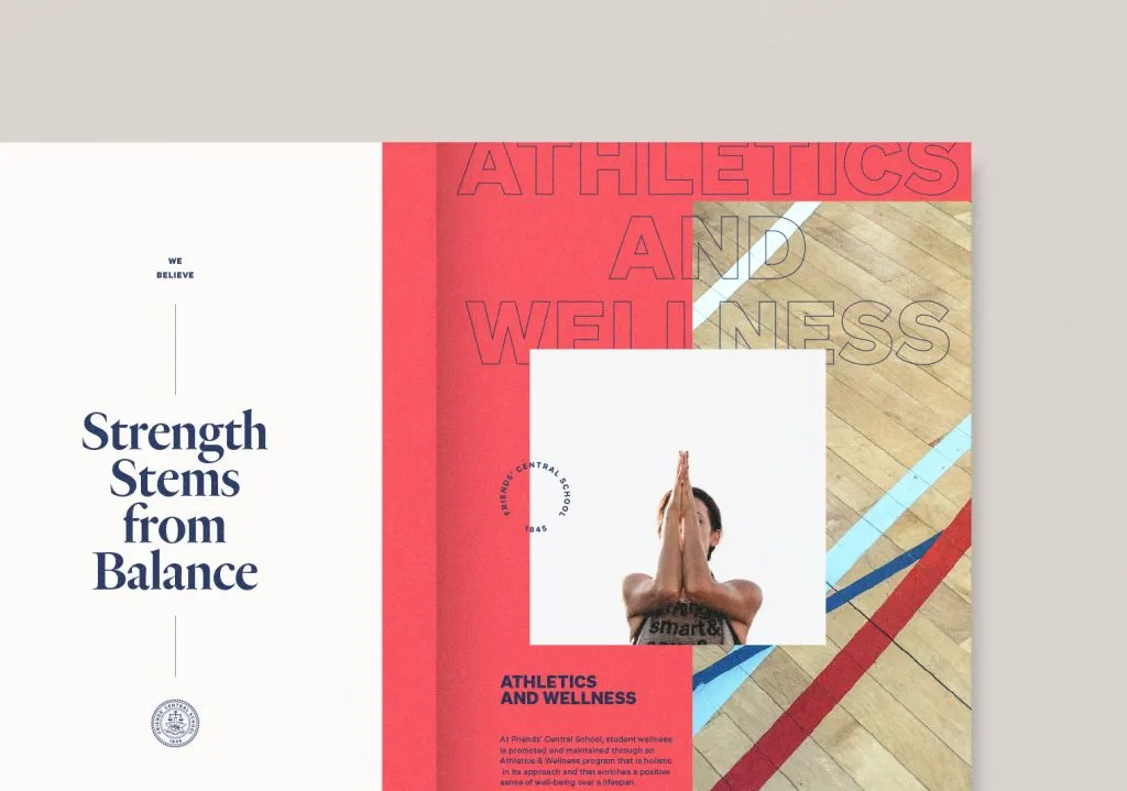
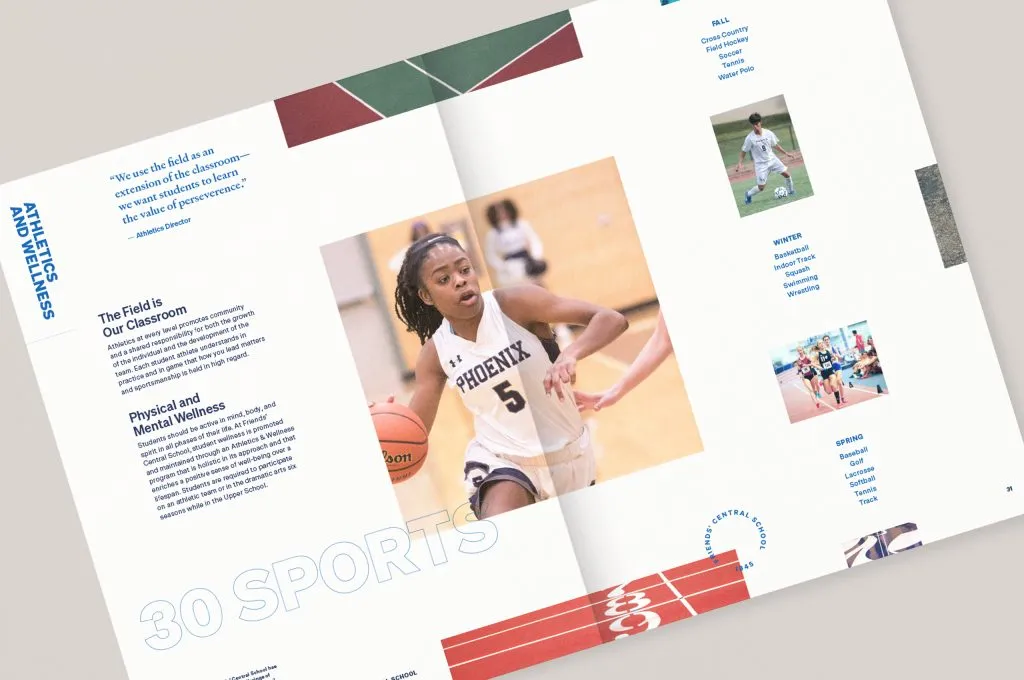
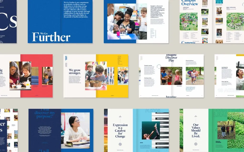
We knew the key to designing Friends’ Central’s viewbook was to put their Quaker Values right at the center, because that’s where their values sit—in every decision, every relationship, and every moment of learning. Our approach was to create a design that reflects how these values shape the school’s identity, highlighting simplicity, integrity, and community in a way that’s both authentic and visually engaging.

Limitless Potential
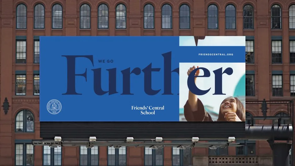
Everything in the composition pushed out from the center, embodying Friends’ Central’s rallying cry of “We Go Further.” We pushed the boundaries of typography, creating bold, expansive layouts that extend beyond the page, visually supporting the idea of limitless potential. Elements bled off the edges, reinforcing the notion of breaking through traditional limits. This approach allowed the design to mirror the school’s commitment to pushing beyond expectations, creating a dynamic visual experience that aligns with their message of always striving for more.
