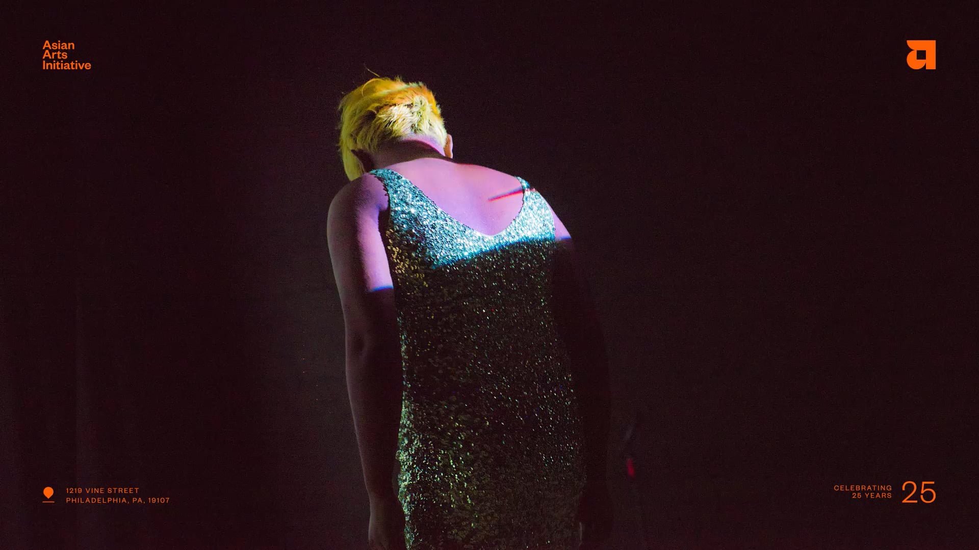
Asian Arts Initiative
At the Center
- Brand Strategy
- Brand Identity
- Branded Environment
- Arts & Culture
AAI came to us when they were at a crossroads. They were created at a time when conflicts were high between the Asian and black communities. But they had evolved into creating and provoking way more thought and dialogue around cultural challenges as a whole. They wanted to position themselves not as just an ‘Asian’ organization, but one that is working to bridge the gap literally and metaphorically between communities. And using art, discourse, and their brick and mortar to do so.
By owning this concept of ‘At the center’ they were able to use it as a platform…at the center of the conversation, at the center of community etc. and really own their role as an influential cultural organization pushing things forward.


Built From Center
The logo builds off the ‘At the center’ concept. The negative space in the a is ‘them’ while the construct of the communities around them are what gives them shape and meaning. The simple geometric shapes that make up the logo also give a subtle nod to Asian characters and typography. In a sense owning their heritage and identity.


Art Full Design System
AAI is a mighty, but small organization. We needed to give them a system that was dialed in and easy to use, but left room to play for their internal designers. We leaned into a vibrant and funky color palette and a flexible grid inspired by crossroads to do just that.


Just Enough
The identity took shape across everything under the sun. We worked closely with the AAI team to pressure test the work in the early days, then they took the system and ran away with it.


Pop in Place
Anyone that’s been to AAI knows it’s busting at the seams with vibrance and the unexpected. We embraced that through an exuberant, yet refined use of color across their spaces. The color pops created a clear and bold wayfinding experience that wrapped around corners and crawled up walls. They became canvases of color that activated the spaces, played well with existing murals, and identified floors, galleries, and work/public spaces.


Directly There
A color-coded directory system welcomes all. The building is home to not only Asian Arts offices, galleries, and theaters—but various non-profit and arts-based tenants. To make sure every visitor gets where they’re going, we created a easy-to-update plaque system to started them on their colorful journey.


Pop and Go
We used the brand colors to differentiate floors, lead people along, and identify destinations. The color pop strategy allows AAI’s space to be draped in their brand and highly function at the same time. From the moment you approach the building, the brand and wayfinding story begins and beautifully leads you to your next stop via color pop.