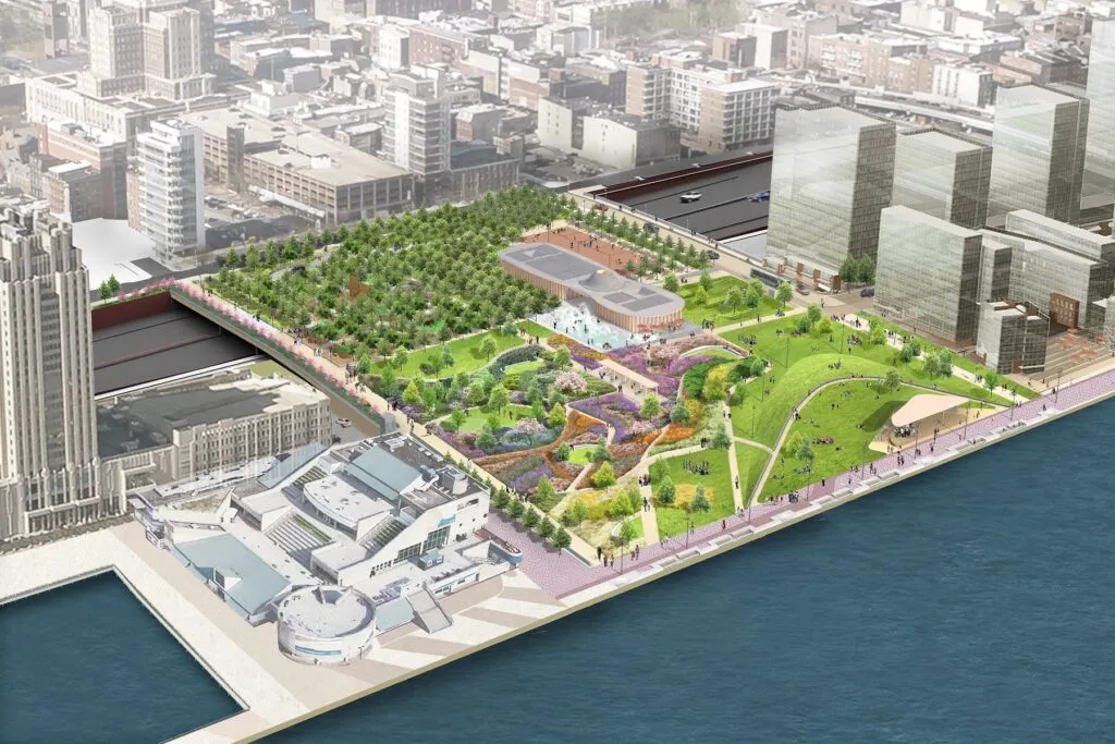
In 2028, Philadelphia’s skyline will feature a game-changing addition: Penn’s Landing Park.
This 12-acre public space will redefine the city’s connection to the Delaware River waterfront, providing a vibrant oasis where nature and urban life coexist. Developing Penn’s Landing Park involved more than just a physical transformation; it also required a branding process that captures the essence of Philadelphia and its residents.
A Collaborative Vision
Branding Penn’s Landing Park required significant collaboration among architects, design firms, and city representatives. From the start, it was clear that creating a brand for this landmark park would need a unique approach. The goal is to develop an identity that would resonate with both Philadelphians and tourists, reflecting the park’s role as a dynamic and inclusive space.

The Role of Wayfinding
A critical element in the park’s branding is wayfinding. In a space as expansive and multifaceted as Penn’s Landing Park, effective wayfinding is essential for guiding visitors and enhancing their overall experience. The new brand incorporates a streamlined system designed to seamlessly direct people to the park’s key attractions and amenities.
This wayfinding system integrates with the overall branding, ensuring that visitors can navigate the park easily while engaging with its visual identity. This practical aspect of the design makes the park accessible and welcoming, reinforcing its role as a community-centric space.
A Brand Inspired by Philadelphia’s Spirit
The new branding for Penn’s Landing Park draws inspiration from Philadelphia’s vibrant character and eclectic culture. The typography reflects the diverse and unique signage of the city’s storefronts, capturing Philadelphia’s rich history and dynamic energy.
The park’s color palette embodies Philadelphia’s spirit. Each color is carefully chosen to reflect the lively and diverse nature of the city. The vibrant hues evoke a sense of energy and inclusivity, reinforcing the park’s role as a welcoming public space where everyone can find something to enjoy.
A Brand for the People
The new identity for Penn’s Landing Park isn’t just about aesthetics; it’s about creating a space that truly reflects the community it serves. The brand is spirited and polished, embodying both the historical richness and forward-looking vision of Philadelphia. This collaborative effort ensures that the park’s branding genuinely represents the city’s resilient spirit and diverse character.

Looking Ahead
As the completion of Penn’s Landing Park approaches, anticipation continues to build. The new branding stands as a powerful symbol of this transformative project, capturing the essence of Philadelphia and its people. It ensures that the park will not only be a place of beauty and activity but also a meaningful part of the city’s cultural and social fabric.


